 For fun, I’d like to begin this week’s post with a list of things I find overwhelming:
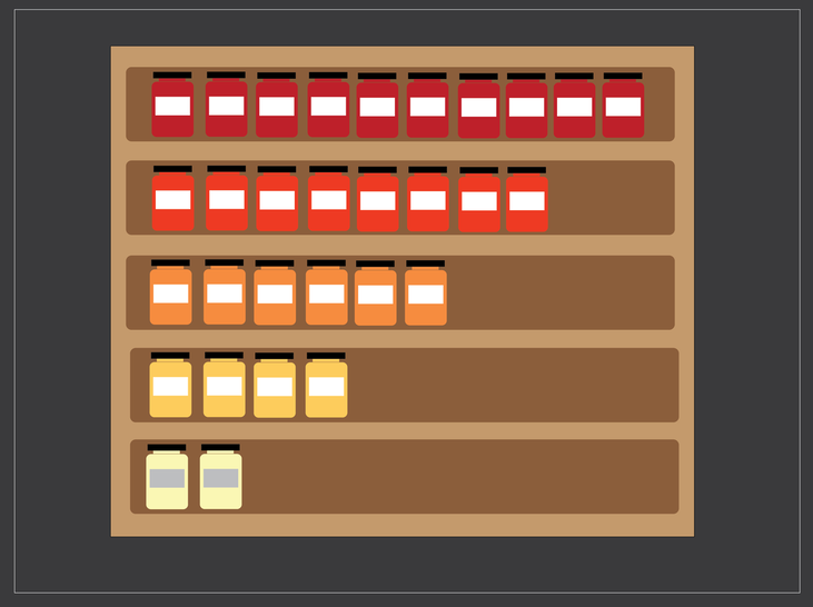
Ok, now it’s your turn. Seriously, send me your list. I feel a little better. You? I’ve resigned myself to the fact that I can’t do anything about the spaghetti sauce aisle. There are at least 200 sauce selections on those shelves, and I envision a future with more. This is the world we’re living in. Sadly salsa is trending in a similar direction. But it’s okay. Some problems we can solve, like how to take data from overwhelming to compelling in a presentation. First I would like to tell you a bit more about the backstage process of my brain when I’m sitting in an audience feeling overwhelmed by data. It’s something like this: Slide 1 - Oh, here’s some data. Feeling fortunate to be listening to an expert in this field. Not everyone gets these kinds of learning opportunities. Slide 2 - This data is fascinating. Who knew there was so much detail. Hmm, my neighbor is taking notes. Maybe I should take some. What kind of notes should I be taking? Slide 3 - I wonder if my neighbor can see the screen. Everything looks mostly grey and fuzzy to me. Maybe I can find a seat closer to the front. Slide 4 - I should make an eye appointment. Slide 5 - Wait, what’s happening right now? I don’t understand anything. Everyone else here knows what’s going on but me. Slide 6 - She’s still taking notes. Crap. Slide 7 - How did I even get this job? Does my boss know that I can’t understand anything? Slide 8 - I’m a total fraud. Slide 9 - Is this what they mean by an existential crisis. Slide 10 - Look-up “existential crisis” later. Not now though. Try to figure out what’s going on. Admittedly I’m taking a risk disclosing my feelings of inadequacy when it comes to interpreting data in presentations. If you’ve found yourself thinking similarly maybe you won’t feel so alone in the world anymore. If you’ve never been in this position, perhaps it will give you window into the minds of some of your audience members. Mostly I hope that it provides you with some inspiration to find the story in your data - and to tell it really well. So you’ve got data, and you’d like to share it in your presentation. Where to begin? The first step is to focus on the goal of your presentation, which you may have learned how to define in Destination Presentation - Gimme a Goal (thanks Jamie). Ask yourself - which of my data points/sets will help me achieve that goal? You likely have far more information you’re able to share, and that’s why editing your data should follow the same process as editing the key points to include in your presentation overall. Along each step of the way, you should continue to challenge yourself - does this information help me achieve my presentation goal? We can all get wrapped up in wanting to share just one more thing because it’s really interesting. Before you know it, you have 47 slides with stats, charts, and graphs in neon colors and wild animal patterns that sparkle when you click on them. You had to do something to make your data exciting after all. There should be recognition that they’ll be differences between the amount of data you can include in your presentation, and that which you’d find in a report. You can certainly provide your audience with the report in it’s entirety, as something to reference after your time together. If you’ve told a compelling story with the data you included in your presentation, audience members are probably more likely to reference the full report later. The next step is to figure out the story you’re trying to tell with the data. These are a few key questions to consider: What are the conclusions that can be drawn? What’s compelling about this information? Are there trends to show? Are there comparisons you’d like to demonstrate? Is there anything surprising or unexpected to share? Answering these questions will help you get closer to figuring out the kind of information to highlight. After you’ve identified the pieces of information to include, the next step is to figure out how to share it with your audience, presumably on a slide that’s projected on a screen. You’re going to need to transform your data into visuals that can be communicated easily and effectively. You’re probably familiar with classic data visualizations such as maps, bar and column charts, pie charts, and Venn diagrams. A quick google search yields many results to help you determine which tool to use and when. The overall take-away here is that the chart type should be determined by the relationship you want to show. The decision should not be based on your personal preference, like “pie charts are pretty” or feeling greater comfort with one tool over another. Once again, the goal is simplifying for the audience and making the data as easy to interpret as possible. Let’s put this idea to the test with a fun bar versus pie chart demo. Pie and bar charts are both great tools for showing parts of something in relationship to the whole (see below). However as you can see in the example - when the percentages are small - it becomes hard to tell which is larger in pie chart form - and difficult to interpret the conclusion to be drawn. It is much easier to see this particular information in bar chart form. Disclosure: this is fake data. As I told you, I am a fraud. I have no idea what the most popular types of pasta sauce are. 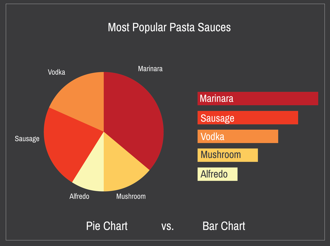 Now, if you decided to go no further with this, you’d be doing just fine. A few things to keep in mind if you are going to use charts and graphs for your data visualizations: Avoid using 3D charts. As I’m sure you’ve seen, there are options in Excel and PowerPoint for making 3D charts and graphs. At first glance, these look impressive, polished, and professional. However they can actually distort relationships, and make it more difficult for audience members to interpret the values in your charts and graphs. See exhibit A below. 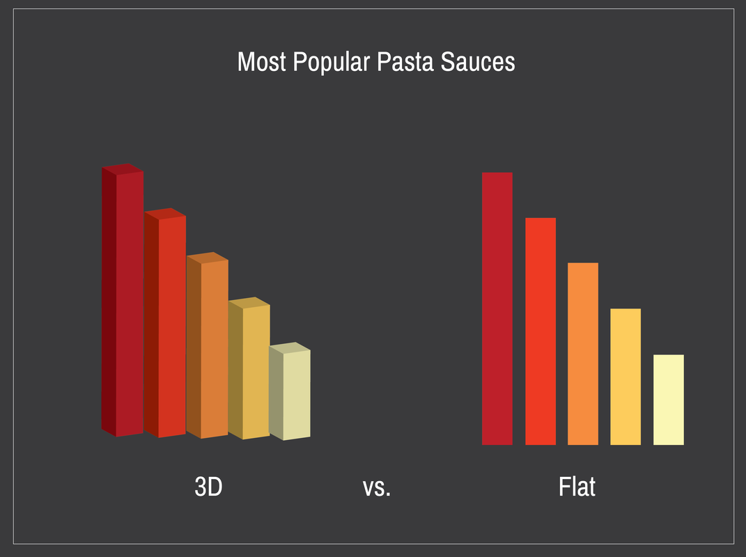 Secondly, reduce the noise created by the tick and grid marks (all those little lines). Make them fade into the background with light colors, or eliminate them entirely. My go-to move is to type in my values and create a graph using the charts features in PowerPoint. Then, I use the basic shapes tools - like rectangles - to recreate the visual with the correct proportions. Then I simply delete the actual chart. There may be other strategies to eliminate this clutter, but this one works quite well for me most of the time. Next you’ll want to be sure to create contrast with your color selection, and take care to select colors that will stand out on the screen. Selecting color palettes can be tough work. Many professional designers use palettes created by someone else. Check out ColorBrewer at www.colorbrewer.org. It’s great source for color palettes for displaying data. Also, single hues can be nice when you are trying to highlight incremental changes. Lastly, let’s talk legends. Legends are really hard to read on a projection screen. No one in the back of the room can see the legend, rendering it useless. I opt for large text labels over legends. If you’re interested in taking your data visualizations to the next level, consider this: use icons and simple illustrations in place of bars in charts to really “hook” the audience. In this method, you’ll be channeling both artist and scientist. It’s a lot of fun, and honestly not difficult. Keep in mind that these visuals shouldn’t be decorative. Data visualization is all about making data easier to understand. Additionally, not all data is appropriate for pictures, so don’t feel the need to completely eliminate traditional charts and graphs. However this gives you a strategy to make your information really stand out in our information-overload age. Here’s the spaghetti sauce data visualization done using this method. This data visualization was created using basic shapes tools. They’ll be more data visualization posts, tips, and tricks to come. In the meantime, if you have a garbage bag lifehack, please send it my way.
0 Comments
Leave a Reply. |
 RSS Feed