 Photo by Patrick Fore on Unsplash We originally published this post a few years ago. Our website got hacked and we're rebuilding. So the data is a few years old, but this data viz - and its development process - is still relevant. I'm always looking around for data visualizations that can capture the essence of complicated issues and distill them visually into easily understood concepts, and I find that the Huffington Post data team does a really good job of this. So when I came across the data viz below (sadly I can't find the original article but I'll keep looking and update this post with the link when I find it) I was inspired by the simplicity of the United States map. Wow. Instead of needing mad drawing skills I could position a bunch of squares together to represent geographic entities. That seemed easy enough. 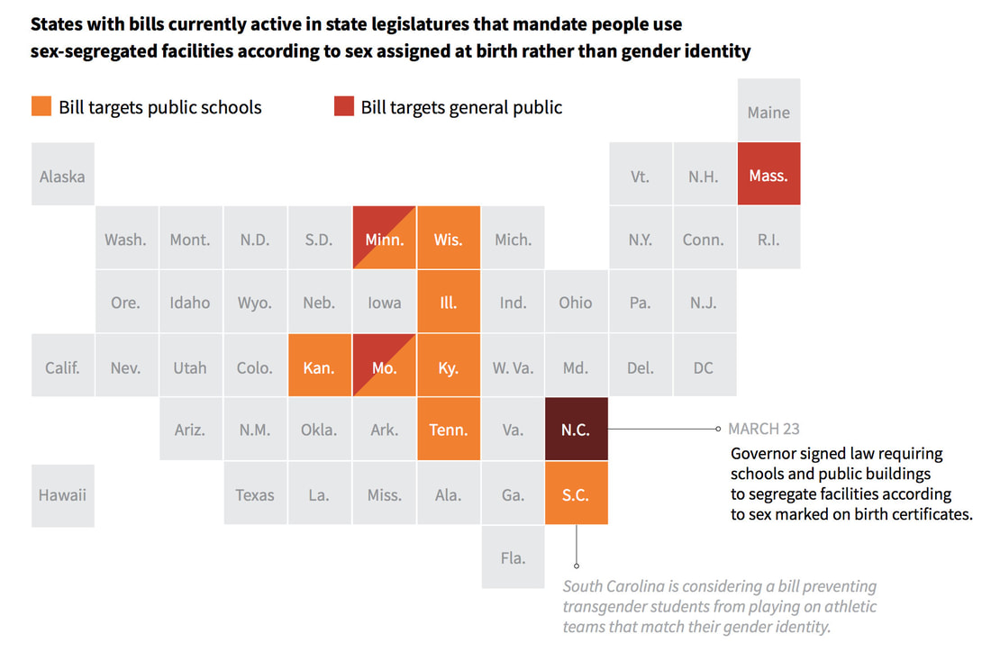 At the time Maine was experiencing a microbrew explosion and my little town of Orono - home to three - was no exception. I challenged myself to represent Maine microbrews using this collection-of-squares method and decided to take it a step further with California microbrews (I grew up in California and I wanted to see how I could replicate the complex shape of the state using squares). I started here, at the Brewer Association website. 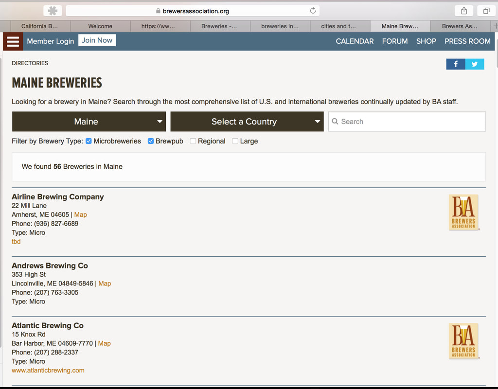 Using a spreadsheet application I made a list of all of the breweries in each state by city or town AND county. Then I counted the number of microbrews by county and developed a range for a color coding system. I started with Maine because there are fewer counties (16) and microbrews (56 at the time). 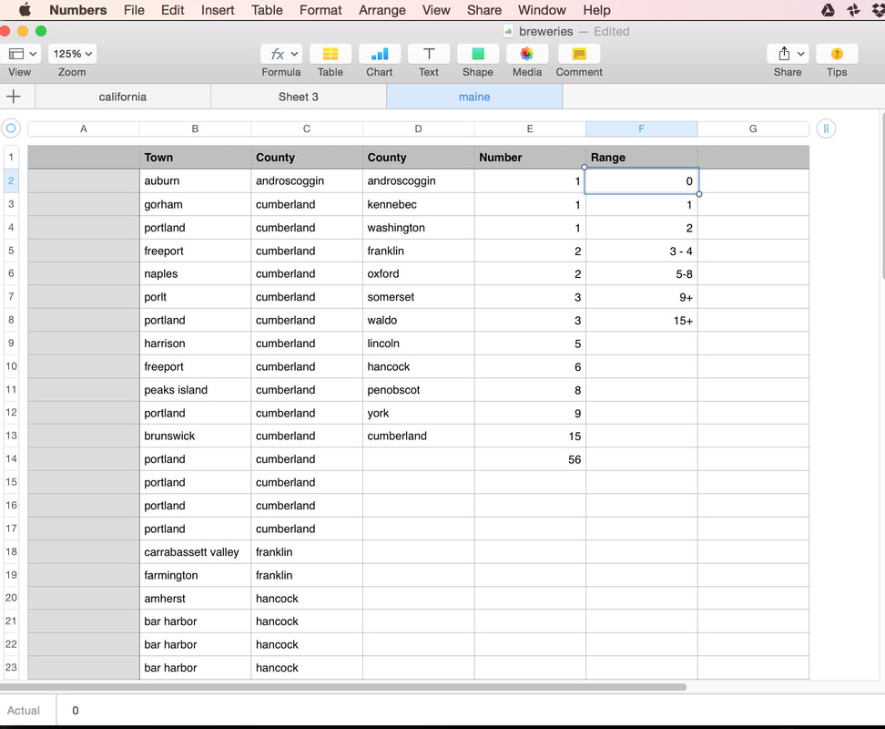 Then I moved on the California with its 58 counties and 557 microbreweries. 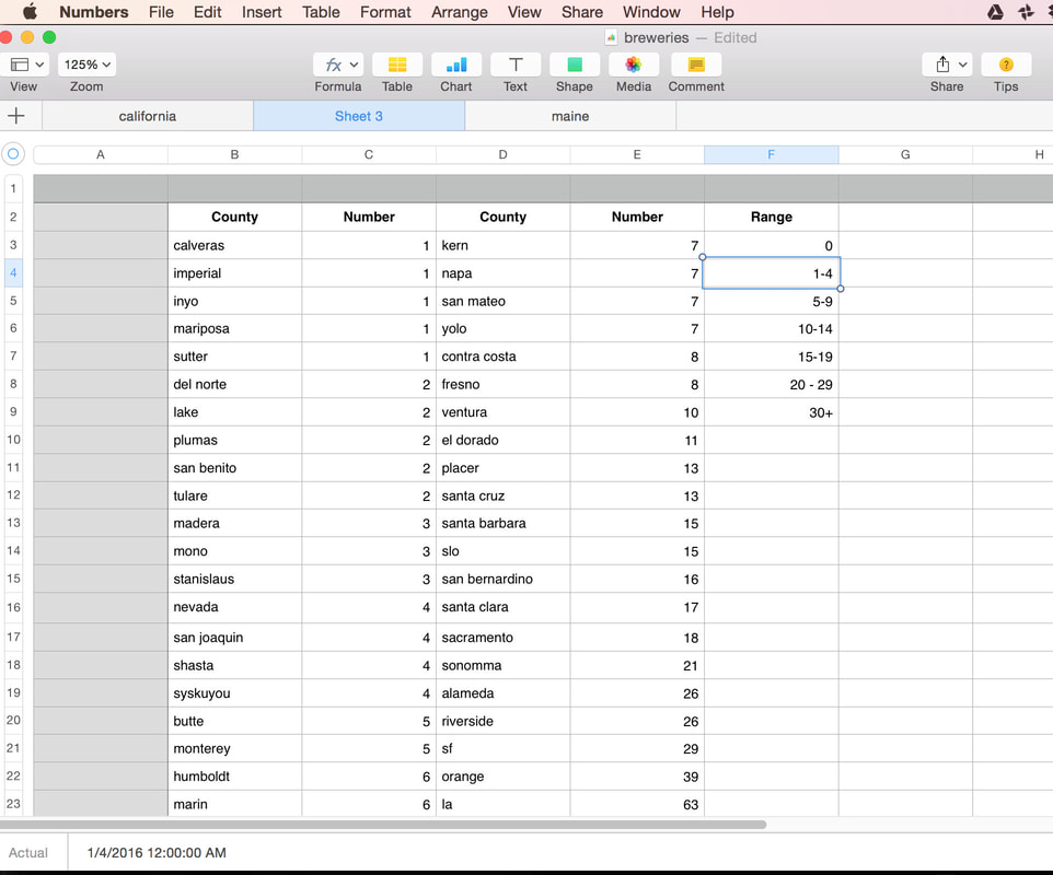 Next step was to represent each state as a collection of square counties. Here's what I came up with for Maine: 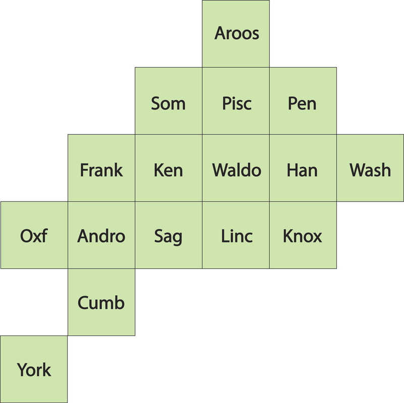 And here is California: 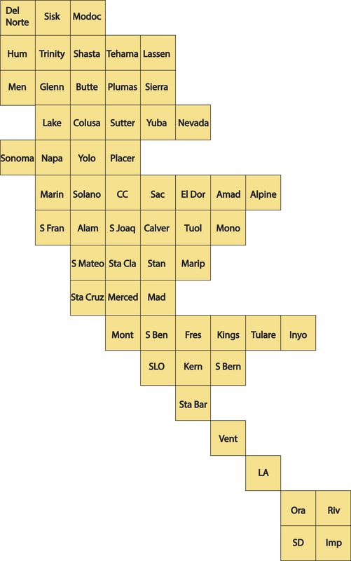 For the record there is no "right" way to do this. I was going for a shape that resembled the shape and contours of each state. Next I picked a color palette. I found this one by googling "beer color palette". Try it, it's fun.  Then I assigned a palette color to each number range from my data set (see above) with no microbrews represented in the lightest (white) color and the darkest shade representing the range with the most microbrews. The last step was to color code each county based on this range. 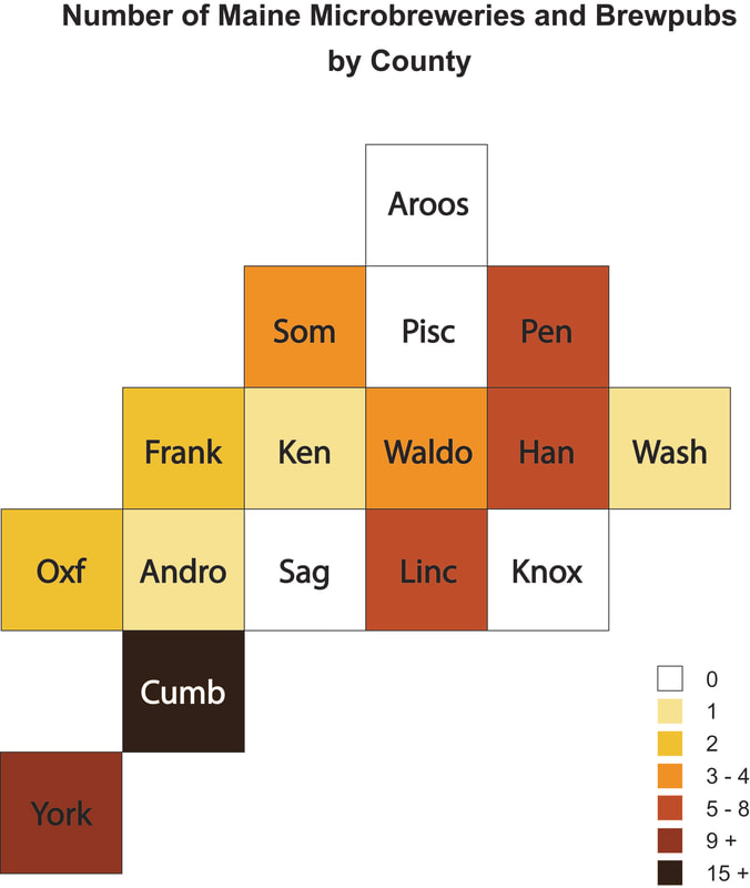 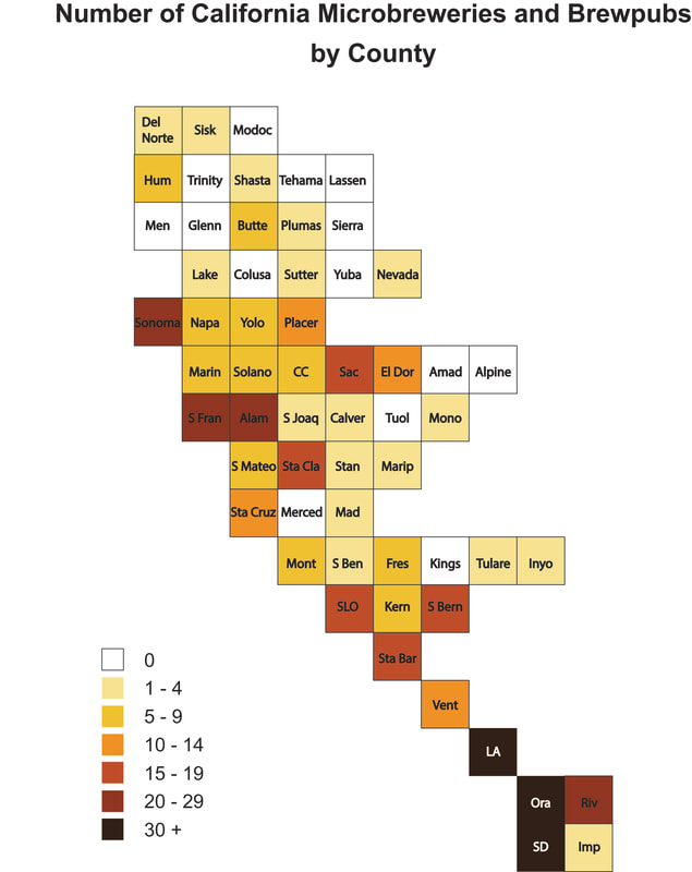 It's no shocker to see that the highest concentration of microbrews are in the counties with the highest population concentrations, and that many rural areas of each state have no microbrews.
This is a fairly simple process. It takes a little time to pull the data together, but I think you'll agree that it is a clean visualization with a lot of versatility. Give it a try and let us know how you make out!
1 Comment
2/11/2022 02:25:20 am
What an amazing post! I always look forward to reading your posts. Leave a Reply. |
 RSS Feed