|
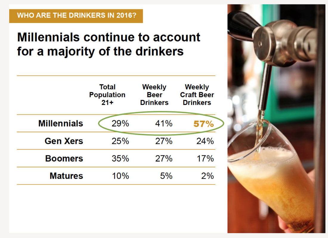
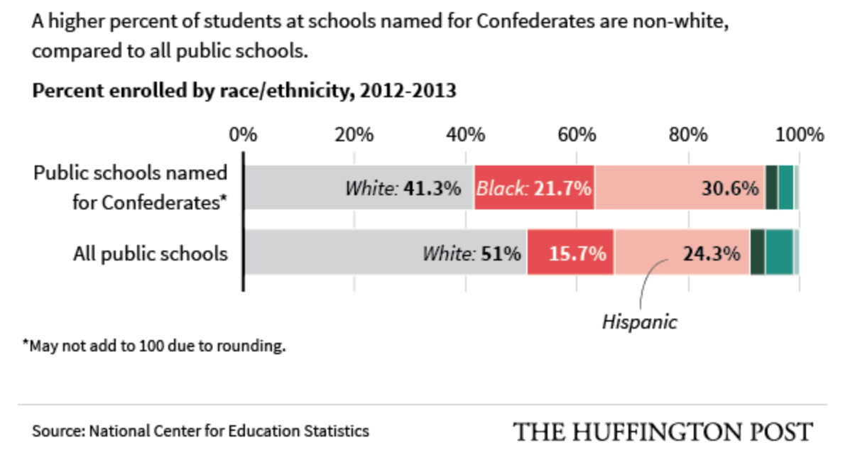
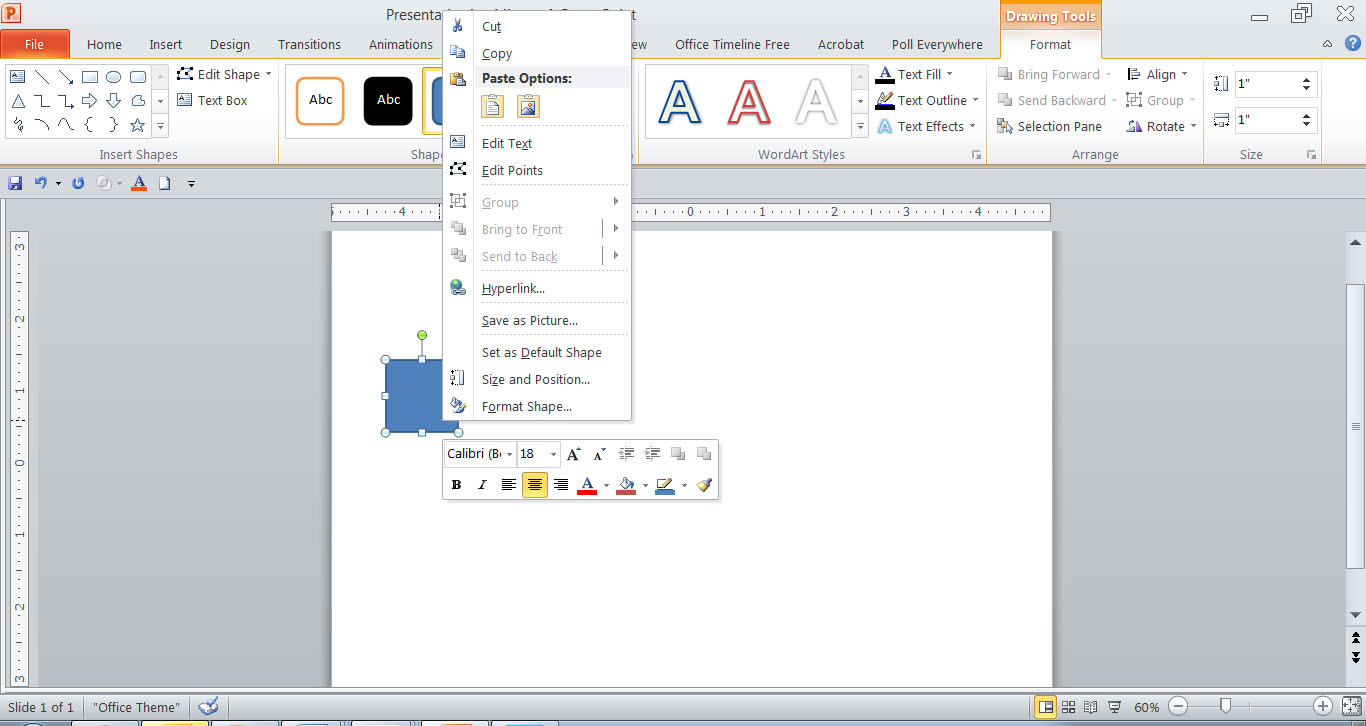
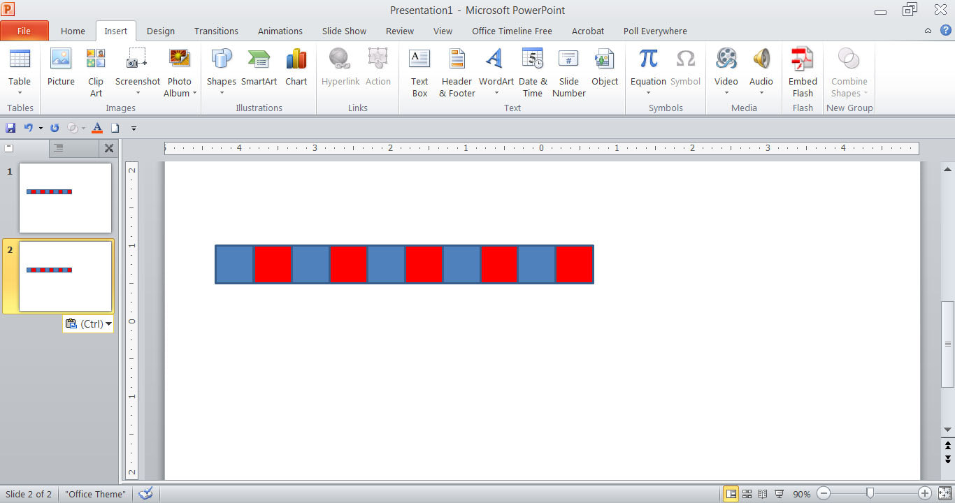
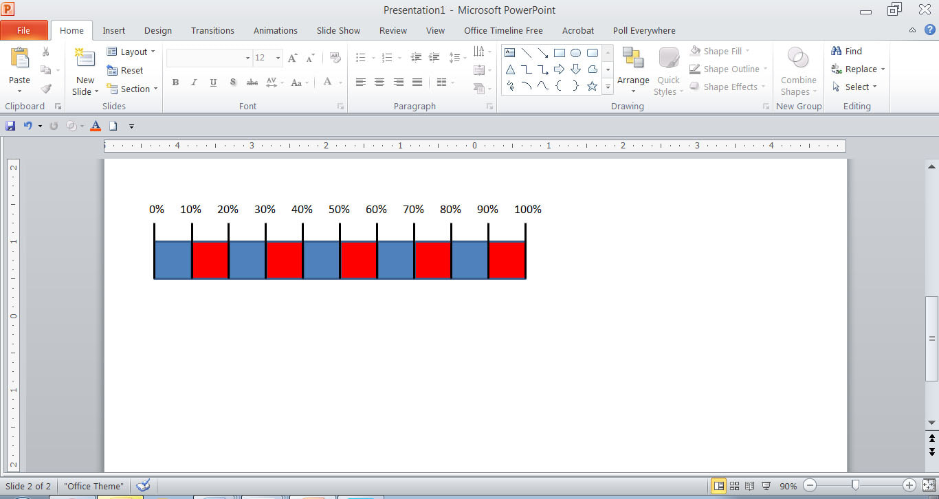
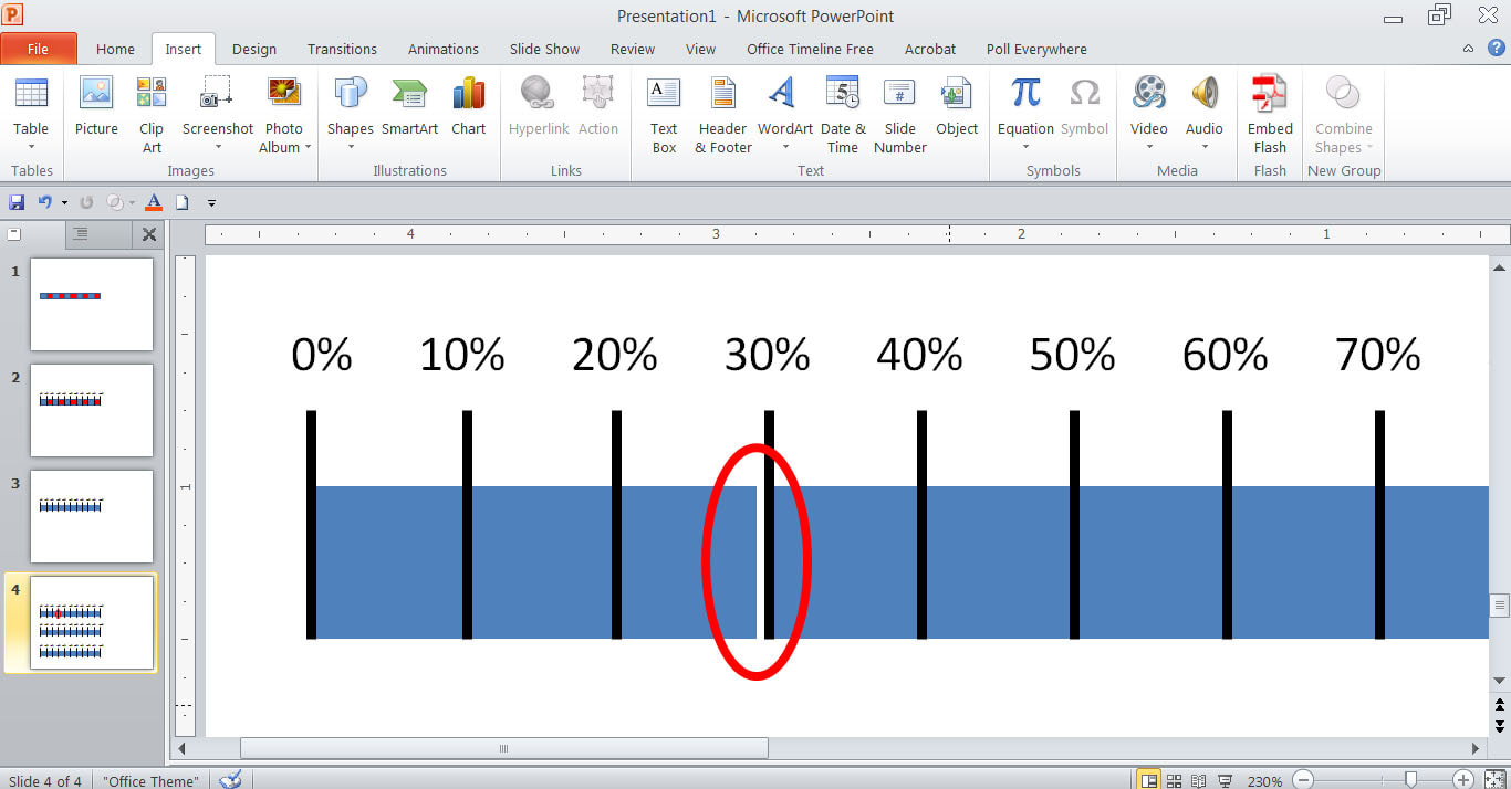
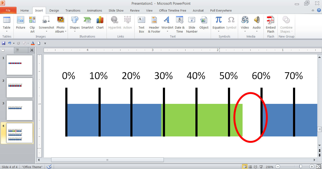
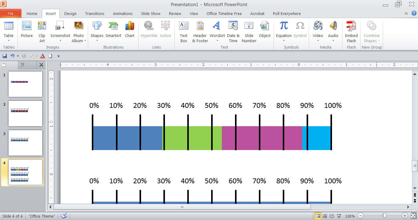
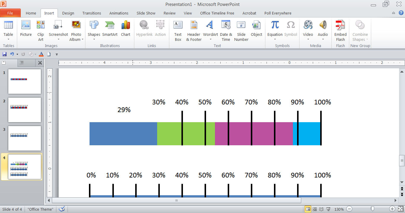
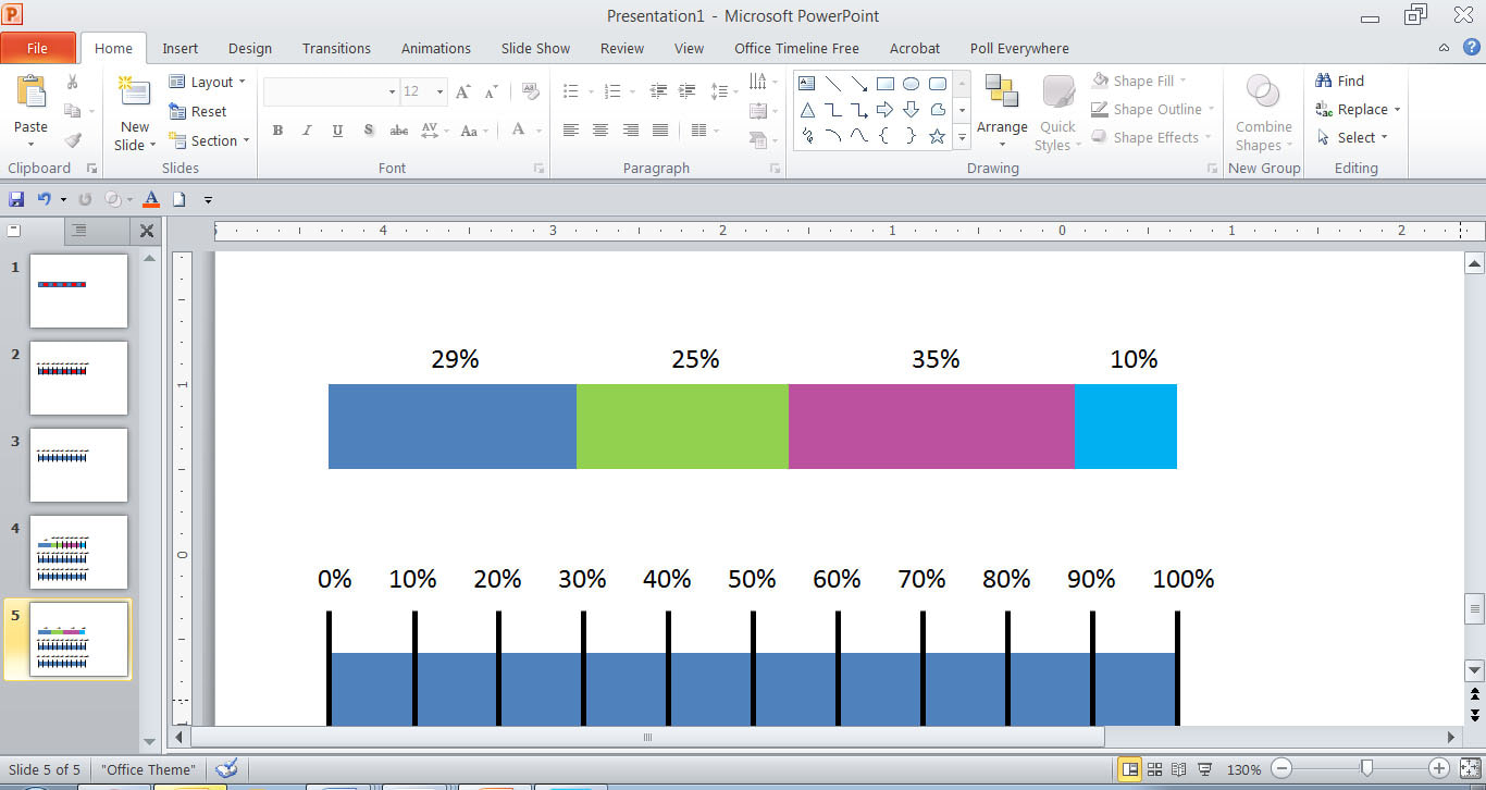
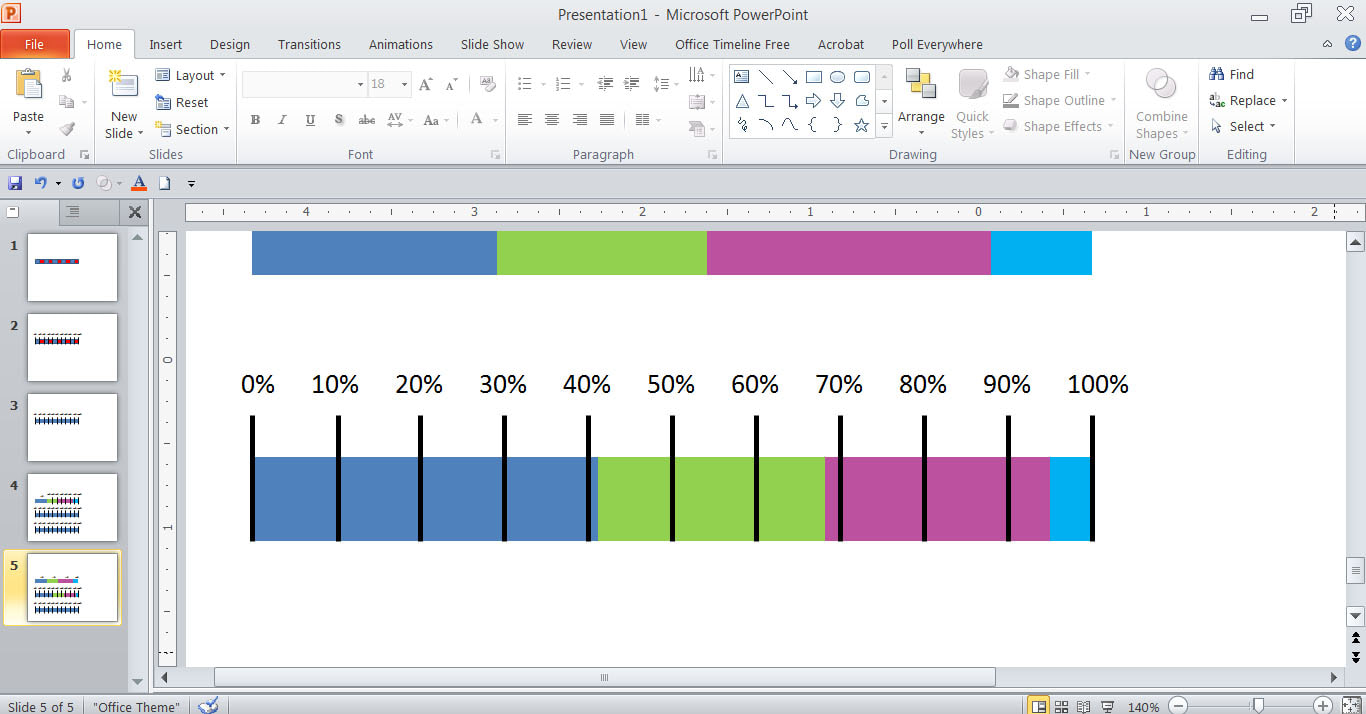
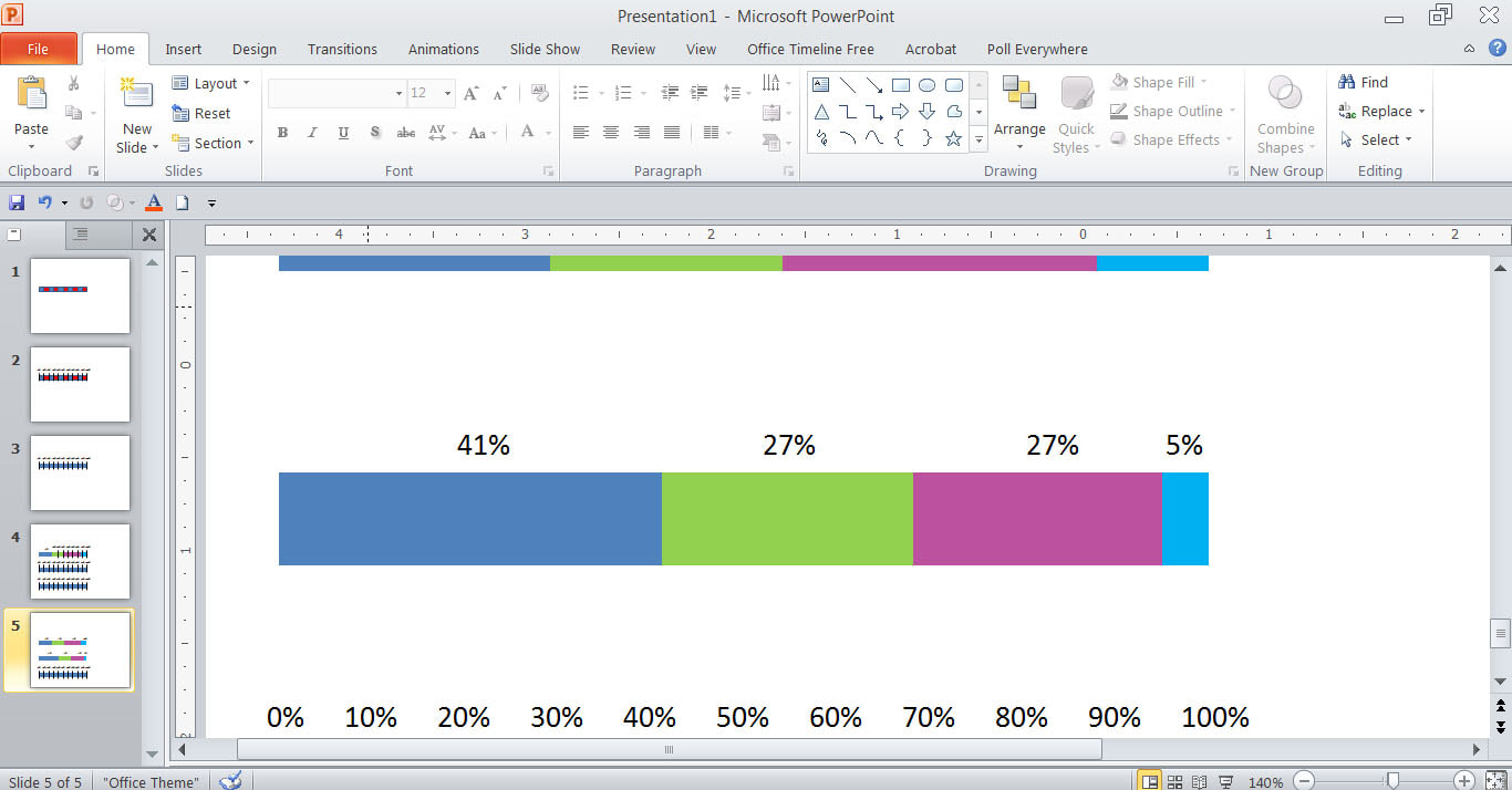
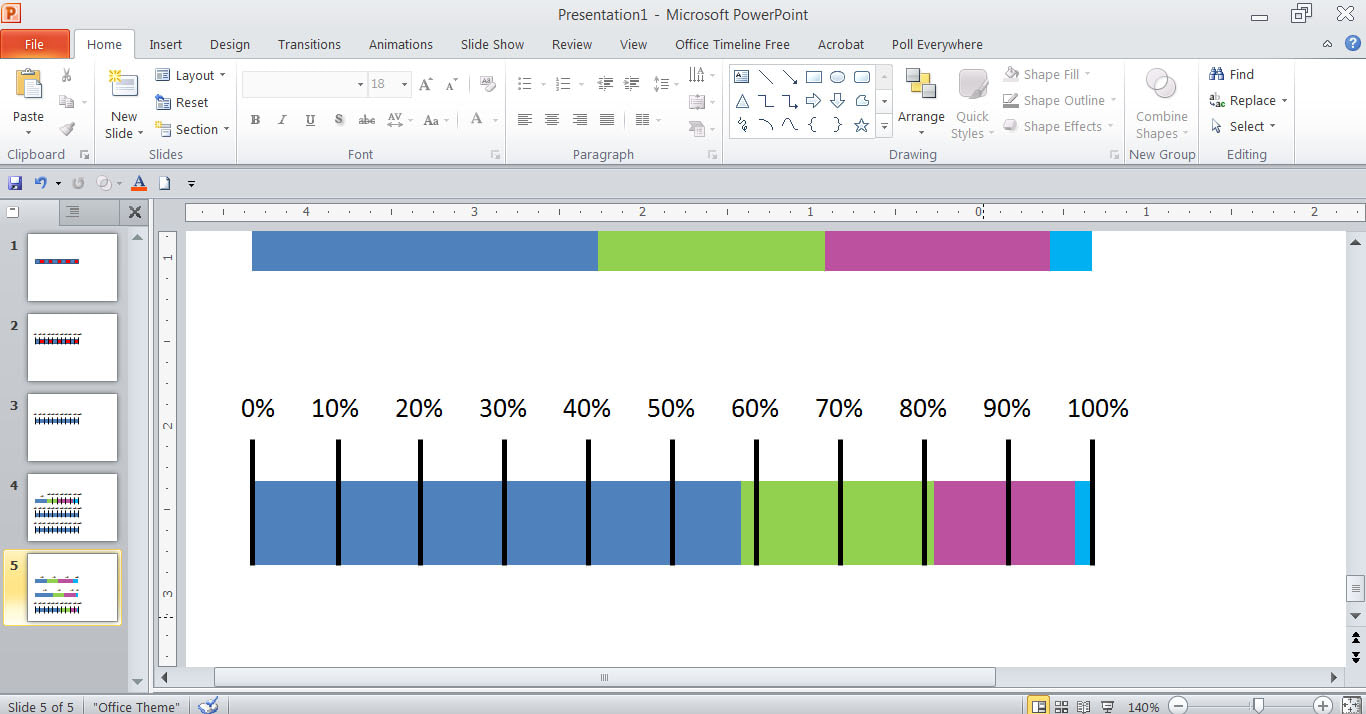
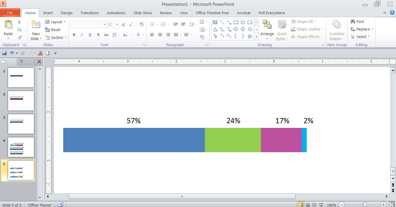
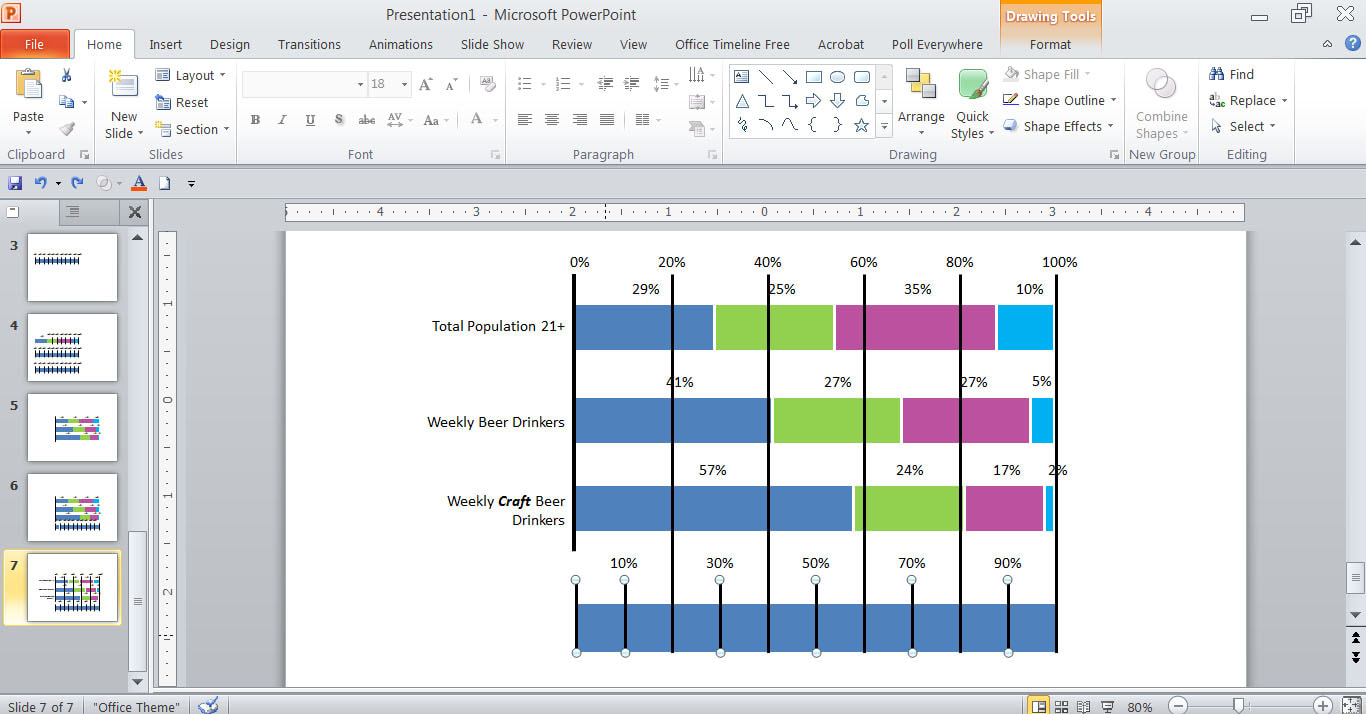
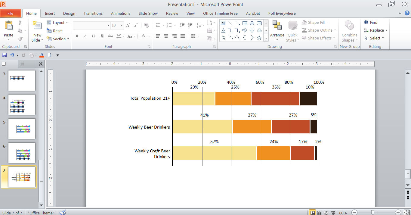
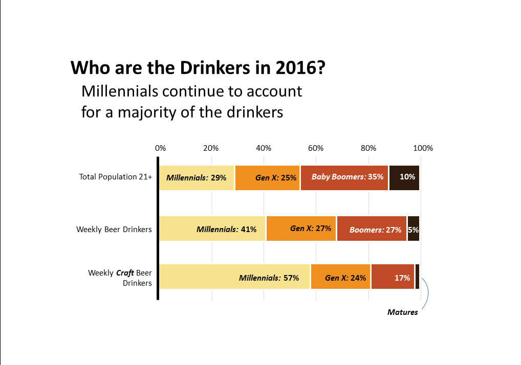
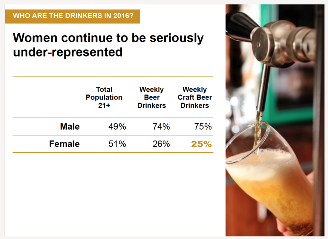
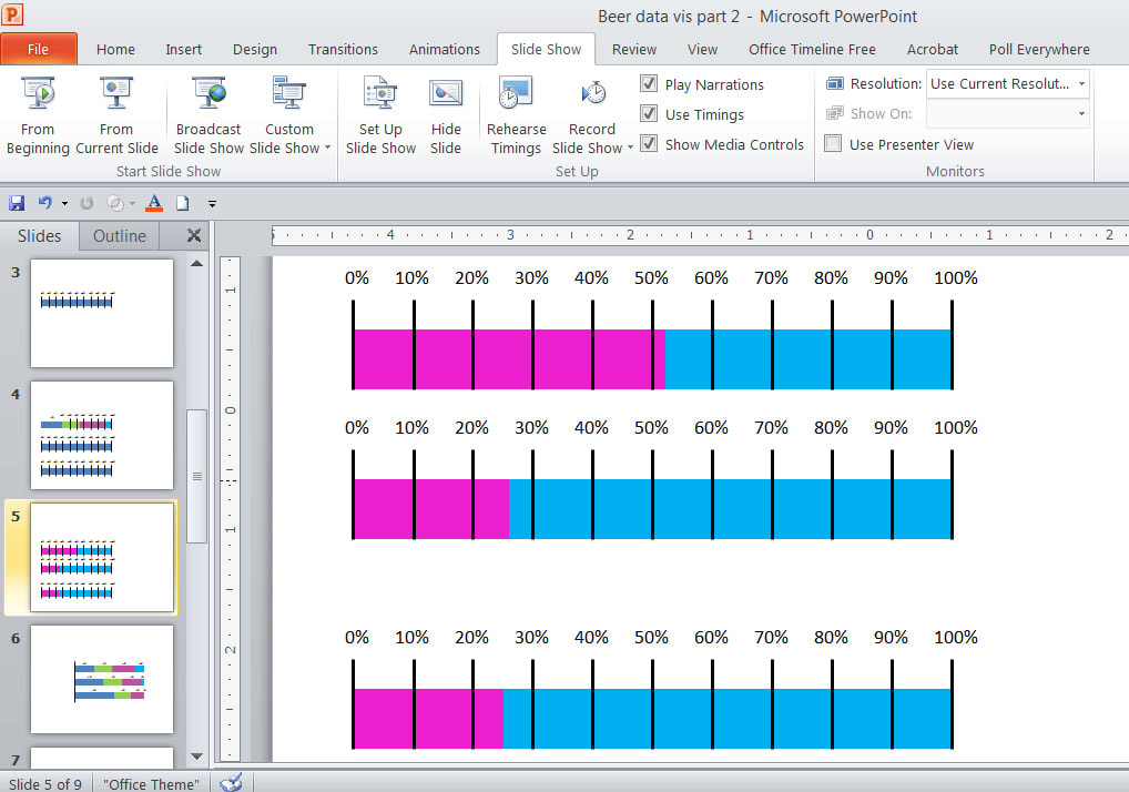
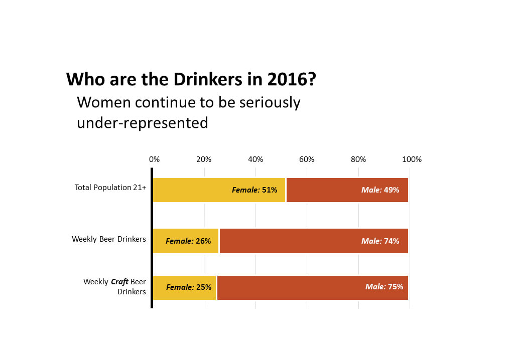
Photo by radovan on Unsplash I had so much fun with the first microbrew data visualization in 2016 that I decided to do another one. this time using an article from the Brewer's Association called, "Today's Craft Beer Lovers: Millennials, Women, and Hispanics" as inspiration. I wanted to convert tables like this that I found in the article: to a data visualization like the 100% stacked bar graph below (thanks to the Huffington Post Data Team for this example...I will link to the original article if I can find it again - we're rebuilding blog posts after a website hack) so the information would transfer more quickly. In terms of function stacked bar graphs show a larger category divided into smaller amounts, in order to show the relationships between those categorie. I like 100% stacked bar graphs because it makes it easier to compare both within a bar graph and between bar graphs. To kick it off I drew a one inch square using my presentation software program (Powerpoint in this case). This square represents 10% of the stacked bar graph. I copied the square 10 times to represent a 100% stacked bar graph of equal proportions and alternated colors so it would be easier for me to work with. Then I marked it to indicate which square represented which percentage, and to serve as guides as I manipulated the squares to the size I needed them to be in order to represent the desired percentages. Read on if this seems confusing. PS The advantage of doing this in powerpoint is that it allows you to copy slides, so I was able to save this square/numeric guide as a template and copy it later - as many times as needed - for the various data visualizations I was creating. The first 100% stacked bar graph I created was the total population age 21+. In the table we see that Millennials are 29% of the population, Gen Xers 25%, Boomers 35%, and Matures 10%. The first step, then is to visually represent Millennials at 29%. I pulled one of the squares a teeny bit to the left to show 29%. Then I went to work on showing Gen Xers at 25%. On a 100% stacked bar graph using data from the original table Millennials occupy the space from 0-29%, Gen Xers occupy the space from 29-54% (for a total of 25%), Boomers occupy the space from 54-89% (for a total of 35%), and Matures occupy the space from 89-99% (for a total of 10%). I pulled the 30-40% square over to meet the end of the Millennial representation at 29%, and then abbreviated the 50-60% square at what should be the 54% mark. The numeric guides we created at the beginning are invaluable in helping determine where the final placement of the square shapes should be. When I had an accurate representation of what 25% for the Gen Xers looked like I colored all of the squares green to visually separate Gen Xers from the Millennials. Then I repeated the process for Boomers and Matures, with magenta representing Boomers and turquoise representing Matures. Then I started removing the guides, but indicated above each number the percentage each color represents. Here you can see that the Millennial blue has 29% above it. And this is the draft "finished" product, showing each population represented by colors of varying lengths. Notice how you can see my second 100% bar graph template directly underneath the one we've been working on, ready to be worked on next. I repeated this process for the weekly beer drinkers by generation.... Weekly beer drinkers: Millennials: 41%; Gen Xers 27%; Boomers: 27%; Matures: 5% And weekly craft beer drinkers by generation. Weekly craft beer drinkers by generation: Millennials: 57%; Gen Xers: 24%; boomers: 17%; Matures: 2%. Together these three charts comprise the full data visualization. Then I put in some numeric guides at the top (0, 20, 40, 60, 80, 100%) with some vertical lines to guide the eye toward the number, and to give the visualization context. When all three 100% stacked bar charts were complete I changed the colors to those of a beer-themed color palette (see Beer Themed Data Visualization, Part One), assigning the lightest color to the Millennials and the darkest to the Matures. The last step is to embed the Millennial, Gen X, Boomer and Mature labels within the respective bar charts, lighten the vertical visual guides and send them to the back, and add a title. Here is the finished product: And I couldn't stop there. For good measure I decided to attempt this table too: The top bar graph is total population, the middle is weekly beer drinkers, and the bottom is weekly craft beer drinkers. Once you've got the template it's really easy and quick! Final product: Again, these 100% stacked bar charts are really versatile. You can use them in nearly any situation where you want to see the relationship between things that total 100%...ie most any type of demographic data would work.
Cheers!
0 Comments
Leave a Reply. |


 RSS Feed